# Get started
## vue-progressive-image
Vue progressive image loading plugin

### Installation
```bash
$ npm install vue-progressive-image
```
### Usage
```javascript
import Vue from "vue";
import VueProgressiveImage from "vue-progressive-image";
Vue.use(VueProgressiveImage);
```
**Progressive image**
Instead of using the normal `img` tag to load images
```html
```
use the `progressive-img` component already globally available after the plugin installation
```html
```
**Progressive background**
It is also possible to apply progressive images as backgrounds and it will have the same props as the progressive-img component
```html
```
### Placeholders
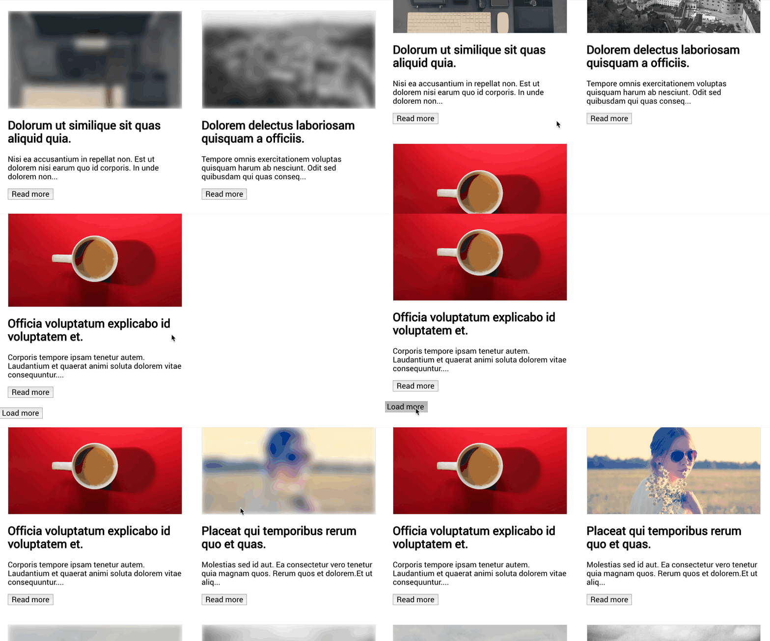
To be able to immediately show some feedback to the user, it is possible to pass a placeholder image, which could be also 1% the size of the main image: it will be blurred so you can go crazy with optimizations here.
in this example, I actually use the same image, but you have the idea here
```html
```
#### The slot (progressive-background only)
The progressive-background has a "content" slot, which can hold content that needs to be rendered over the background image and also can hold a preloader. This slot has one property called "visible" that tells you when, for example, a preloader needs to be visible or not.
```html
I am some content to display over the image
I am the preloader
```
#### Blur
It is possible to adjust the level of blur applied to the placeholder image
```html
```
#### Ratio
It is possible to remove the padding that adds the aspect ratio to the container.
```html
```
It is also possible to manually specify the image aspect ratio when you know it. It allows the placeholder to be displayed in the correct aspect ratio. The ratio is calculated as `height / width`.
```html
```
### Image fallback
In case of a loading error of the main image, it is possible to add a fallback image which can display an error image or just another image.
```html
```
### Events
Each component emits an event whenever an image is loaded.
Because we usually load two images, the main image and a placeholder, two events are dispatched `onLoad` and `onLoadPlaceholder`
in your js file
```javascript
export default {
methods: {
onLoad() {
// main image is loaded
},
onLoadPlaceholder() {
// placeholder image is loaded
},
onError(error) {
// main image error
},
onErrorPlaceholder(error) {
// placeholder image error
},
},
};
```
in the html just add the events you need to listen to
```html
```
### Options
During the installation process, it is possible to pass some default global options
**Cached images**
* type: Boolean
* default: true
Cached images are checked by default. This check kills the animation if the image was already loaded once. If you would like to show the animation every time, even when is not needed, you can simply use the plugin options like so:
```javascript
Vue.use(VueProgressiveImage, {
cache: false,
});
```
**placeholder**
* type: String
* required: false
```javascript
Vue.use(VueProgressiveImage, {
placeholder: "https://unsplash.it/1920/1080?image=20",
});
```
**blur**
* type: Number
* required: false
* default: 5
```javascript
Vue.use(VueProgressiveImage, {
blur: 30,
});
```
**delay**
* type: Number
* default: 0
This option is for debugging only. It lets you have an easy look at the placeholder before the main image is fully loaded.
```javascript
Vue.use(VueProgressiveImage, {
delay: 2000, // 2 seconds before the image is displayed
});
```
**Global options like `placeholder` and `blur` will be applied only to components that don't specify their own options**